
Product Sales Dashboard
This sales dashboard provides a high level overview of overall sales across nine different categories simultaneously. In this view, the sales of each of these categories can be trended over time. This can help provide immediate feedback regarding the impact of certain sales programs (e.g. promotions) or unexpected events (e.g. site downtimes).
Components of the Dashboard
Two Visualizations, Two Purposes
The dashboard contains two primarily visualizations in two columns. The left half of the dashboard displays underlying trend lines. The purpose is to expose deviations of trend lines with respect to other trends within the same period of time. Since the focus is on the trend, these graphs are actually “zoomed-in” where the zero axis is not actually shown. This means that each row (e.g. Level 1 vs Level 2) do not necessarily share the same scale, but the trend differences between them are clear. However, within Level 1, you can clearly see the difference in volume between the various Categories.
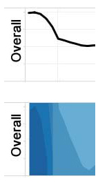 The right half of the dashboard helps visualizes the same information, but in a manner to compare across the rows (e.g. Level 1 vs. Level 2). These visualizations are called horizon graphs. The height of the horizon chart is fixed, which causes the graph to “wrap around” itself if it exceeds the height of the graph. For example, if the height is fixed at 100 and the value is 120, the value will wrap around the top and show the value 20, but in a darker shade. This allows a user to quickly compare the overall values between each of the rows, but simultaneously make it easy to determine when minimums and maximums occur. See the example to the right of how these two graphs visualize the data differently.
Why Nine Categories?
There’s a balance of how many practical categories that can be crammed onto a single dashboard. This often is highly driven by how users look at the various categories. In this example, I simulated 3 Levels with 3 Categories each. This could be pushed perhaps to 4 of each, but I would shy away from anything higher. There simply is a practical limit of how many lines a person can quickly compare against without losing reference. Further, the overall dashboard layout follows the thought process of a say a marketing person.
- How is the overall sales trending?
- How does this look broken out by Level? Is there a specific category that looks atypical from historical trends?
- Now let’s look broken out by Category, across all Levels. Is there anything atypical in the overall historical trends?